UNIVERSITY FINAL MAJOR PROJECT
UteroScope
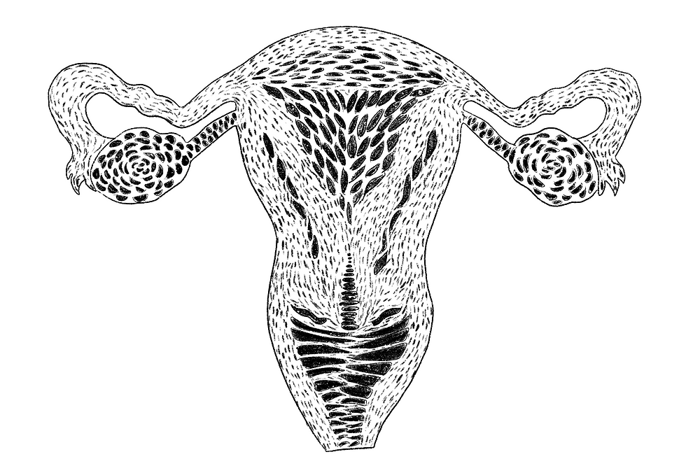
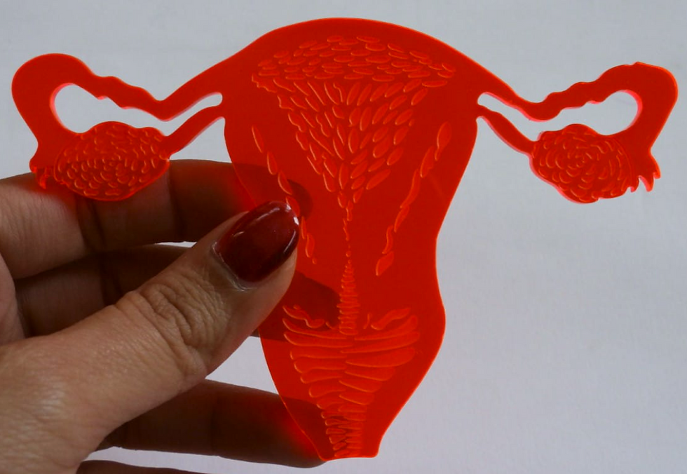
A small laser-cut piece of plastic in the shape of a uterus was designed to be the anchor, in the hopes that the intended users would pick it up and play around with it so that it increases physical interaction.
It was also intended to be designed as an engaging collectible-like item that teenagers could hold on to and not lose easily.


THE PROBLEM
SOLUTION + USER FLOW
After some research into pedagogies, game-based learning was determined to be the best way forward. AR (specifically WebXR) was the chosen medium for this tool, as its advantages for educational use are vast.
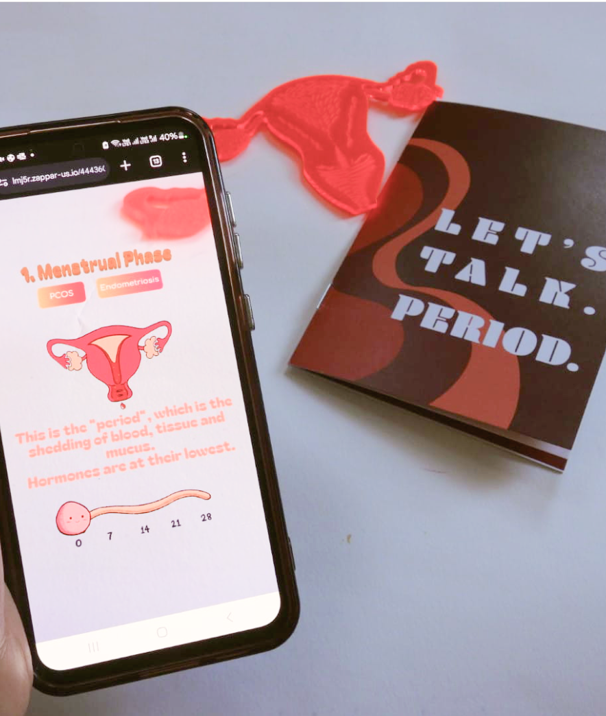
One key point was to develop a hybrid solution rather than making a purely digital or a purely physical product. This is because people have varying access to technology, and this topic is more of an issue in communities who have limited access to tech. This is where the idea of developing a companion zine came into play. The physical uterus cutout that doubled as an AR anchor was developed as a collectible.


Zine
Colour scheme derived from blood and uterine colours, wave-like designs to denote uterine linings
Bold font: Unapologetic.
Name: A play on words. Denotes that it is a serious issue that needs to be talked about more openly. Emphasizes the need for open conversation from everyone.
WHAT IT IS
This project combines a collectible uterus cutout with an augmented reality (AR) experience where users can explore how hormones affect the body and see real-time changes.
A companion zine brings the learning to life with playful activities like Period Bingo, hormone intros, and a curated period playlist to set the mood.
With simple sliders and toggles, users can also explore what conditions like PCOS or endometriosis might look like.


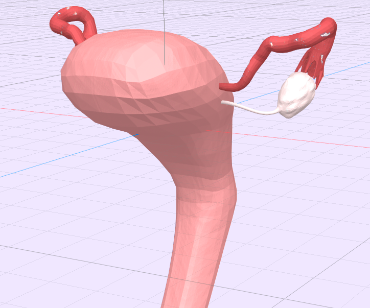
3D modelling experimentations
After developing 3D assets for the AR experience, I did some more research into the world of AR, and found that AR and VR (and other mixed/extended reality) were already saturated with clinical, hyper-realistic visuals and models.
This was also one of the pain points in early competitor analysis. I want this to be a fun experience that engages the target audience, not a hyper-realistic rendition for someone studying anatomy in med school. So I decided to pivot the style.


AR Assets
A 2D, ‘scrapbook-y’ style that is reminiscent of teenage doodling was thought to be the best way to move forward with developing the visuals.
4 illustrations (frames) of the uterus representing the 4 stages of the cycle were made to begin with (menstrual, follicular, ovulatory and luteal).
The entire experience was meant to look like a teenage scrapbook/doodle illustration so all of the assets were developed in 2D, trying to capture that visual style. So the sliders, the buttons, and so on were designed entirely like 2D doodles to increase user engagement.

Ovi: the virtual assistant


