UX DESIGN CHALLENGE
Goodreads Evaluation + Redesign
A heuristic evaluation of the Goodreads landing page guided by Nielsen’s 10 Usability Heuristics revealed issues in navigation, consistency, and accessibility. The redesigned homepage introduces a simplified information hierarchy, clearer interaction patterns, and enhanced accessibility, resulting in a modern, cleaner, and more user-friendly experience.


Hi-Fidelity: Design Rationale
In terms of assumptions, I worked on the premise that Goodreads’ user base values functionality and book discovery as well as social “performance”, as I assume that quite a significant proportion of the users are part of the “book-tok” community. Hence, the design balances utility and vanity metrics.
Accessibility was a central consideration in the redesign. I ensuredsufficient colour contrast ratios for text and UI elements and semantic structuring of content for screen readers. Inclusive design principles, such as offering multiple visual cues for actions (
(colour + icon + text) ensure that diverse user groups can comfortably engage with the platform.
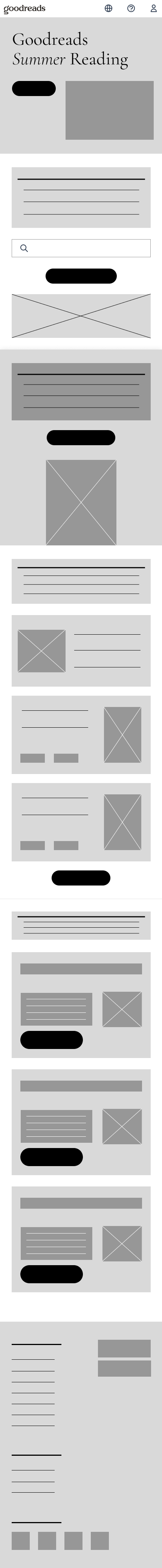
Lo-Fidelity
-
Clearer sections and information architecture
-
Use of CTAs
-
Modular design
-
Consistent spacing
-
Easier navigation
-
Larger tap targets for mobile