DESIGN INTERNSHIP
CONSIGLI
Consigli is a firm that built an autonomous AI engineer to reduce cost, risk and carbon footprint in the real estate/construction industry. Worked on a few projects in my time there: product redesign, website revamp and other branding and visual design work.

1. PRODUCT REDESIGN
1. Qualitative Research and User Persona Definition
2. Redesigned their entire product, giving it a fresher, cleaner and simpler look to cater to an audience who is trying to embrace AI in real estate but is not fully comfortable with it yet.
3. Altered the user flows so that this novel and complicated process became simpler.
4. Came up with an AI chat-based report generation feature where the users would be given prompts to describe their report and they could also edit the AI-generated report before finalising and downloading it, but that was shelved due to budget decisions and technical constraints.
The Challenge
The previous product's UI looked old, cluttered and it was difficult to orient yourself in the journey, especially for first time users. The task was to make it look modern minimal while also ensuring that first-time users were able to navigate the space comfortably.

Research and Insights
After speaking to the users, personas were created to better understand what the struggles were and how to mitigate them. The main users were determined to be people in the world of real estate that were experts in their own fields (contractors and developers) but were skeptical of evolving technology and unfamiliar with AI.

Product Features --> User Journey
From the research and insights, a user journey map that outlined the high level flow for how the users would accomplish their task at hand was created.

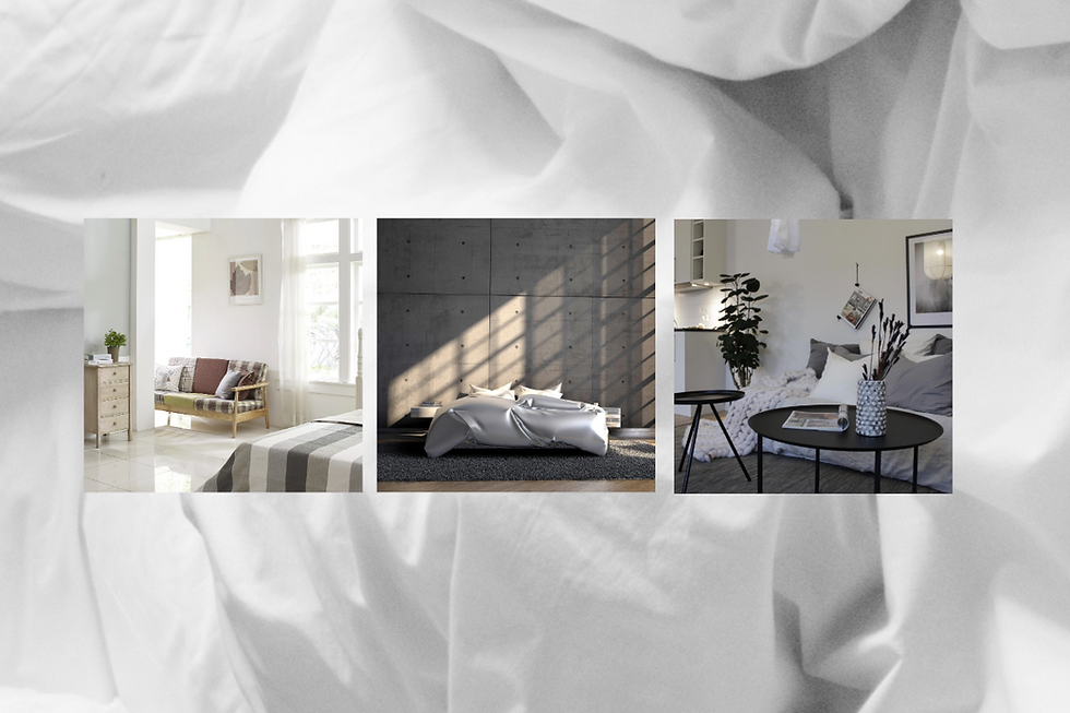
Moodboard
The brand identity was refreshed to pay homage to its Norwegian roots. Colours and themes were drawn from Scandinavian interiors: simple, minimal, elegant and neutral.
The management was heavily inspired by the Apple website. The guidance I received was to avoid using any secondary colour, even for highlights, so it was a bit challenging to work with only white, black and grey. A beige/gold tone was considered to come across as "luxurious", but was eventually scrapped as it could not provide enough contrast and did not pass any of the accessibility checks.
.png)


Design Experimentation and Outcome
The main areas of focus were the main challenges and issues that were highlighted while doing an evaluation of the old tool:
1. Aesthetic and minimal design: Ample spacing, modern card-layouts and subtle micro-animations were used to enhance the overall user experience
2. Eliminating jargon: Explanations are provided wherever possible. The language was changed to be much more friendly and human-like to reduce skepticism.
3. Users could always search using colloquial terms for something they needed and orient themselves. E.g., searching for "plan ceiling risers" would take users to the MEP Ceiling plan service and users are then guided through the steps.
4. The tool now tells users exactly what it does and how it can benefit them.
WEBSITE REVAMP
After redesigning the tool, the company website was also refreshed to better reflect the new and improved product. The website was also another opportunity to highlight the brand story: this was a company founded and run by women, so they wanted to highlight that the autonomous AI engineer was a woman as both tech and real estate are very male-dominated areas. Keeping that in mind, and using their existing brand assets (the blue waves) to signify a shift towards AI, some variations of a landing page were created, one of which is included here.

OTHER VISUAL DESIGN
Worked on creating promotional materials and visual assets for a podcast that was launched in February 2025. Available to listen on Spotify or Apple Podcasts. Developed the visuals, logo, banners and motion graphics for the podcast and the wider Consigli Community initiative


